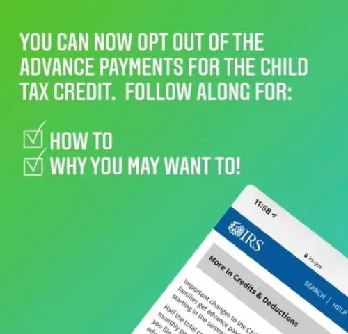
I was scrolling through Facebook recently when I came across an interesting post. It was a multi-image marketing piece on why people might want to opt out of the 2021 Child Tax Credit payments. As someone who is about to receive these payments, my interest was piqued. Would these payments thrust me into a huge tax hole that I would have to climb out of later? Should I think about opting out? I began reading through the slides to learn more.
Discouraged by the data
There were 14 slides. About halfway in, I found what I was looking for: the sample calculation. This would ideally tell me how much money, if any, I would owe in taxes next year if I didn’t opt out of the payments. But then I read,
“For these purposes, assume…the family had joint income of $145,000 in 2020.”
Say what?! Who is bringing home $145,000 jointly in this economy?
For a comparison, the median joint income in the U.S. was about $78,000 last year — nearly half of the example amount. And I’m single. So cut that $78,000 in half, too.
So confusing
From that point, a host of other questions flooded my brain:
- Why did the writer pick $145,000 for the sample calculation — an amount made by only a small number of U.S. households? (She doesn’t say.)
- Why not use median income numbers?
- Do median income earners avoid the future tax burden?
- Where could I go to find out?
None of these questions were answered in the slides.

This troubled me. Suddenly, the whole post felt like a trick designed to convince people to choose against their best interests. Maybe it wasn’t, but who can be sure in these times? I certainly didn’t have time to investigate further.
The crux of the matter
When writing a marketing or informational piece, several factors must be taken into account. The first is your target audience. The second is your medium of communication. The third is where you will distribute it. There’s also style, language, tone, timeliness, branding and positioning. All of these factors have to be in sync for a piece to succeed.
I found this post on Facebook, targeting parents of young children, presented in multiple colored slides that included hashtags and emojis. In other words, the medium, style, and positioning all shouted, “This was made for you!” But because the data used was so far removed from my reality— and the reality of every other Millennial parent I know — I came away frustrated, annoyed, and deeply distrustful of the writer’s intentions.
Had the writer simply used median income numbers, or said up front that the information targeted upper middle-class earners, I would have felt much differently. Instead, I was left to grapple with the math myself or search the Web for more relevant information. Not good.
No one wants to research taxes in their spare time, after all.
A lesson learned
It’s possible that the writer chose the data she did to make her calculations easier. But in the process, she alienated most of the people who will read that post. The same thing happens any time a copywriter uses data that the target audience can’t grasp or relate to. As writers, we have to do the heavy lifting for marketing communications to succeed. The figures we choose and how we present them can persuade readers to take action…or push them away forever.


Leave a Reply